ASP.NET checkbox and radio button vertical text alignment problems
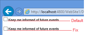
Within ASP.NET you might find when you add a control to the page that the text does not line up correctly with the checkbox or radio button with the text "falling off" the bottom of the checkbox.
This looks rather awkward.
I've seen several fixes that involve wrapping the checkbox in a DIV which seems over the top and you'll end up with stray DIVs defined all over your ASP.NET project.
Instead create a new class AlignedControl
.AlignedControl Label
{
position: relative;
top: -2px;
}
Assign the CSS class using the CssClass property. This will cause the checkbox and it's corresponding label to be wrapped in a SPAN which allows everything to work correctly
<asp:CheckBox ID="chkKeepInformed" CssClass="AlignedControl" runat="server" Text="Keep me informed of future events" />
This is the difference with and without the fix.
The same applies to radio buttons.
Want to document your SQL server database configuration? Track changes to your SQL databases?
Check out our Database Documentation tool


Comments
Post a Comment